← All work
Netflix · Discover LMS
Product & UI Designer
Platform redesign
Rebuilding how Netflix teams find what to learn.
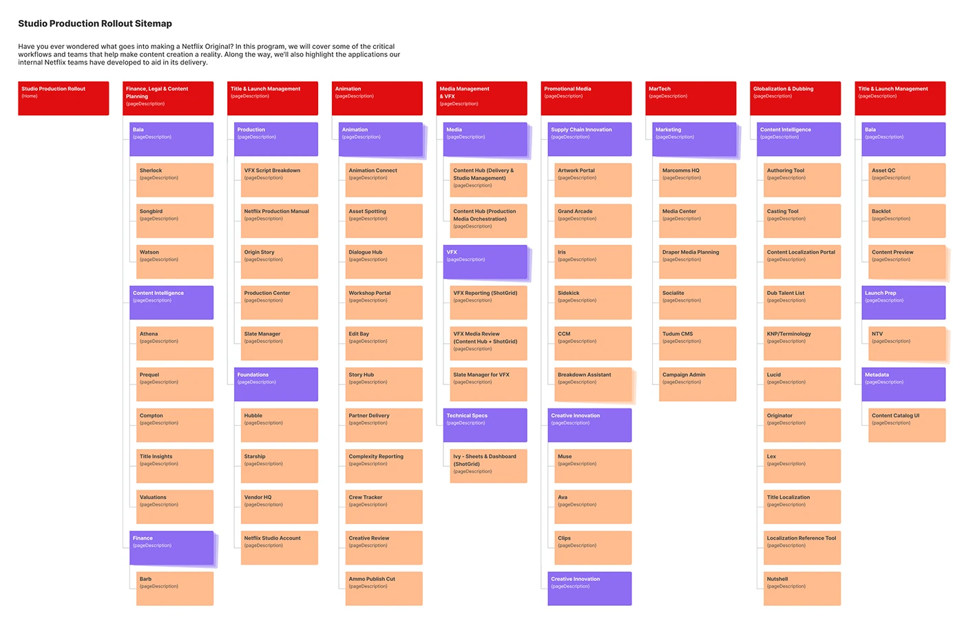
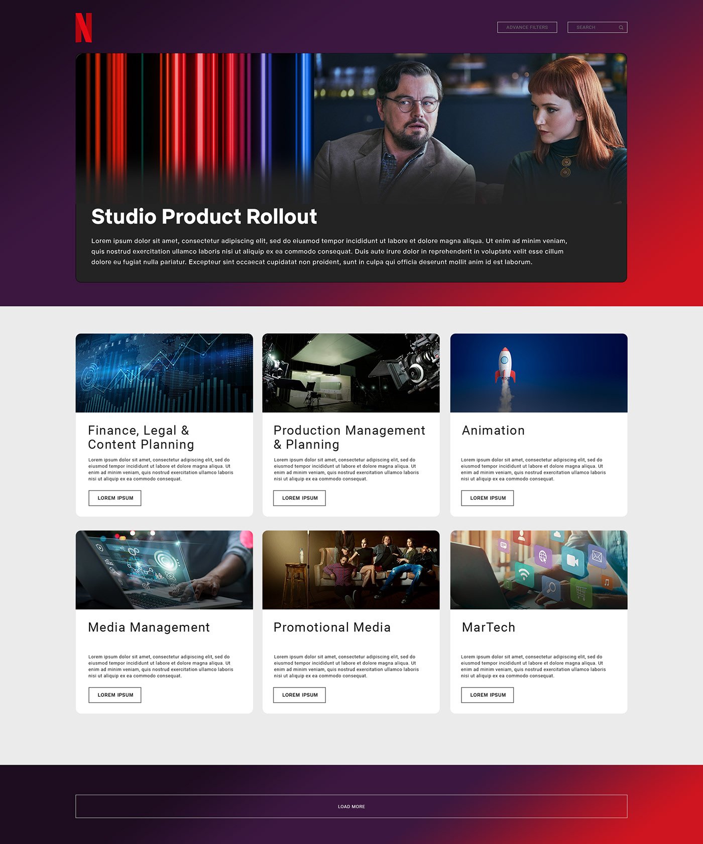
Netflix's Studio Production Rollout content was scattered across 60 apps and 16 teams, on a templated site nobody wanted to use. I redesigned it into a single, engaging hub inside the Discover learning platform, built to be discovered, not endured.
RoleProduct & UI Designer
Team3 · Design + partners
ToolsFigma · Adobe CS · Google Meet
PlatformDiscover LMS
100%
found the old site hard to navigate
60→1
content sources consolidated to one hub
↑
engagement & enrollment (add figure)
↓
time-to-find a course (add figure)
01 / Context
Learning that no one could find
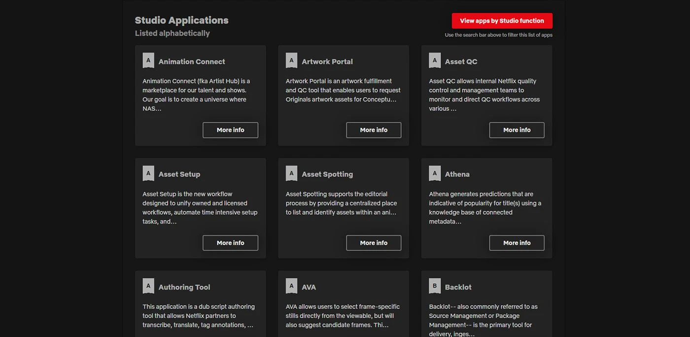
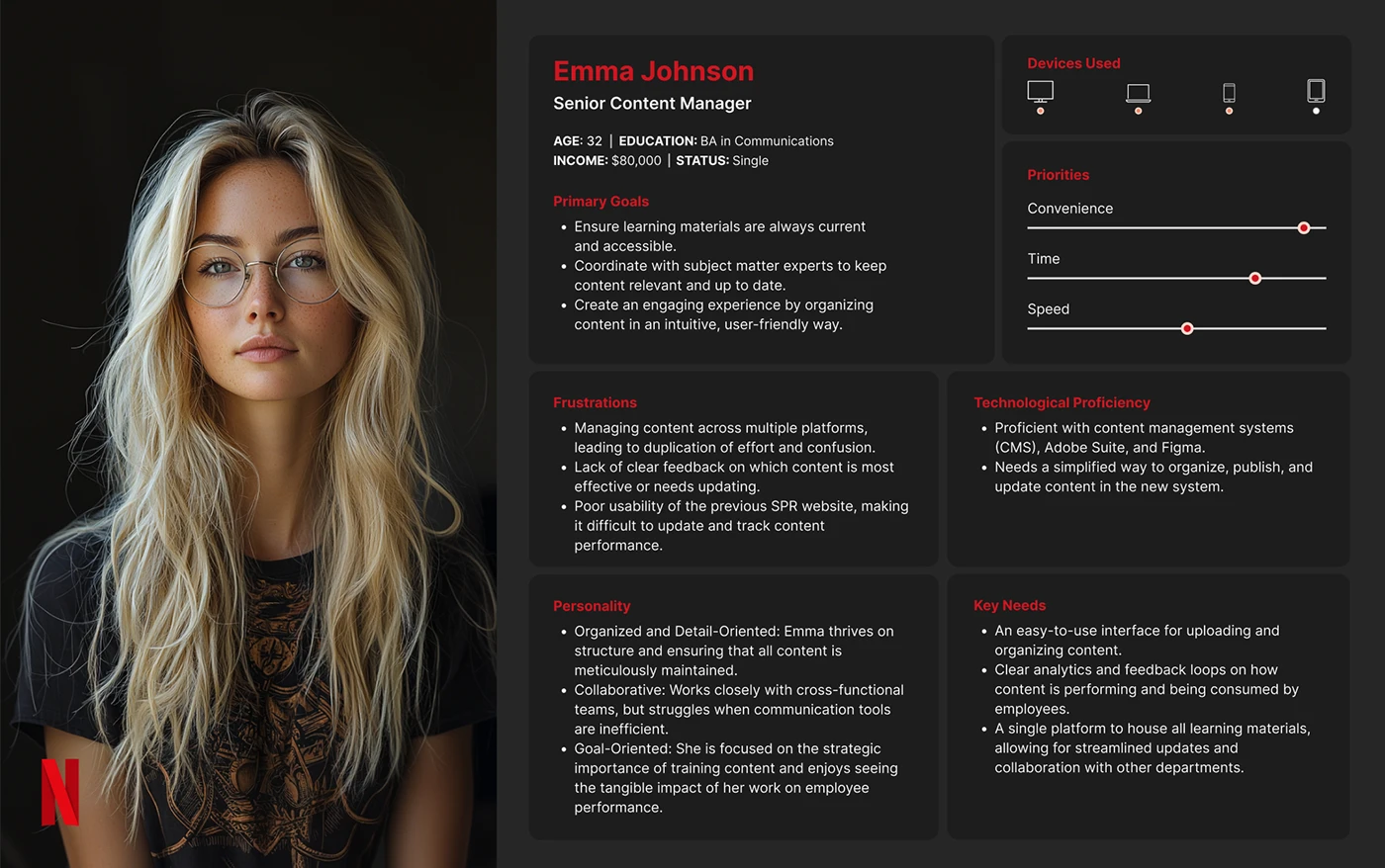
Studio Production Rollout (SPR) trains Netflix's internal teams on the tools and processes behind productions. The content was good, but it lived in three different systems (App Center, Edu & Engage, and Discover), fragmented across 60 apps organized by 16 functional teams.
The existing SPR site sat on a generic template: low usability, poor conversion, and missing the functionality learners actually needed. And because this training is optional for employees, a hard-to-use site didn't just frustrate people, it quietly killed engagement. Nobody had to be there, so friction meant they left.
02 / The problem
Framing the real challenge
Because enrollment was voluntary, the design challenge wasn't just usability, it was motivation. I anchored the work to one statement:
"Netflix employees need an engaging, easy-to-navigate SPR hub that makes optional learning worth showing up for."
I also catalogued exactly why the old site failed, so the redesign had explicit targets to beat: a convoluted journey, low conversion, off-brand visuals, no scalable structure, endless scrolling through 100+ cards, and missing functionality for finding materials.
03 / Discovery
Interviews, workshops, benchmarks
I ran a layered discovery: stakeholder interviews to set measurable goals, user interviews with employees and content managers to surface real navigation pain, cross-functional workshops to map journeys together, and a competitive scan of other LMS platforms to set the bar.
04 / The surprise
A finding that reset the goal
Affinity mapping surfaced something blunt enough to change the brief:
100% of users found the old SPR site hard to navigate and short on anything that made them want to engage.
That reframed the work. I'd assumed I was improving a website; the research said I was really building a place to access content, a discoverable hub inside the Discover LMS, not a prettier version of the same template. The problem statement evolved: help employees easily access and consume learning, not just look at it.
05 / Users
Three people to design for
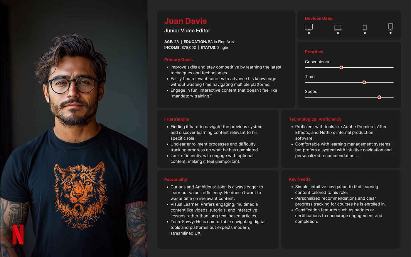
Content Manager
Owns the material
Keeps learning content organized, current, and accessible. Needs a structure that scales as content grows.
Employee Learner
The audience
Seeks out skills on their own time. Values fast access and content engaging enough to justify optional effort.
Team Leader
The multiplier
Nudges the team toward learning and tracks progress. Needs visibility into completion and momentum.
06 / Goals
What the redesign had to deliver
- Scalable & responsive, a fast-loading experience across devices that grows with the content library.
- On-brand craft, UX and UI that belong in Netflix's design language, not a stock template.
- Conversion-focused, clear CTAs, logical structure, real search, and comfortable navigation to drive enrollment.
- An engaging hub, one place inside Discover to browse e-learning, docs, and video, for new and tenured employees alike.
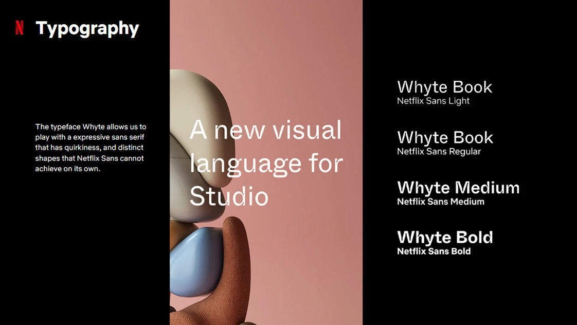
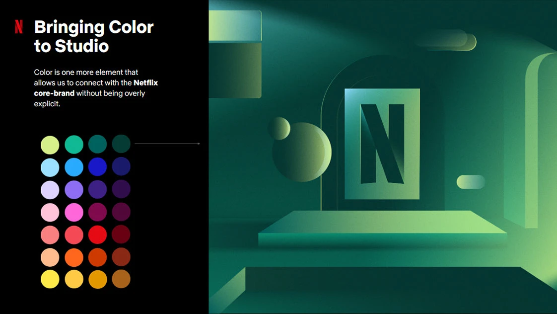
A visual language for Studio: Whyte across weights, and a color system that connects to the Netflix core brand without shouting.
07 / Design
Wireframes to a working hub
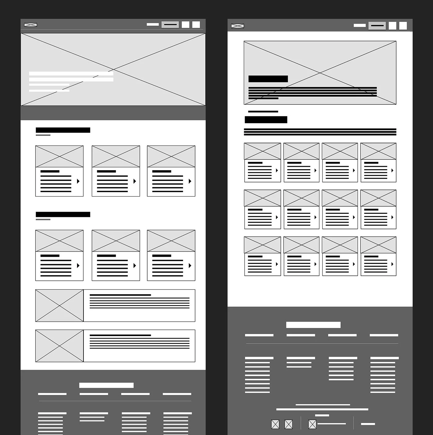
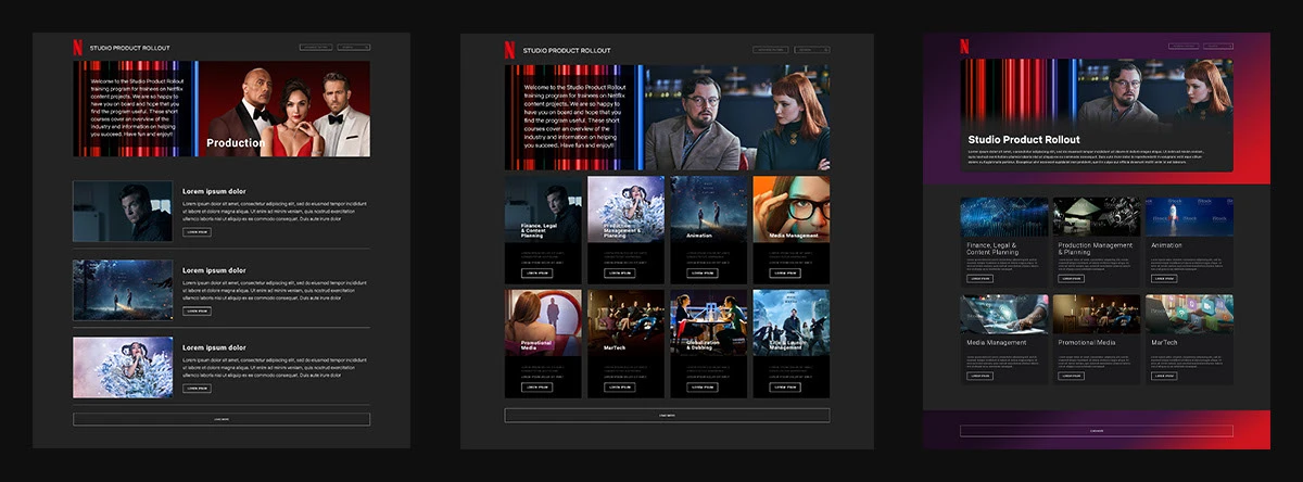
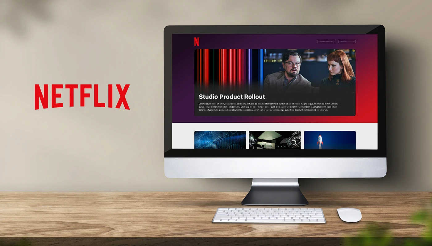
I settled structure in low fidelity first, testing navigation and content discovery before any styling, then iterated toward high fidelity, folding stakeholder and user feedback in each round. The recurring fix was scannability: the old single-item rows ate too much vertical space, so the new layout traded the endless card wall for a browsable, searchable structure.
08 / Validation
Testing the flow
I tested from wireframes onward against a core task: "You're a Netflix employee looking for a video-editing course, find it and enroll." Sessions exposed clear fixes and a wish list.
Fix first
- Stronger visual cues for navigation.
- Clearer separation between content sections.
- Denser, more scannable list items, less vertical space per row.
- More findable buttons and functions.
Nice-to-haves for later
- A "my enrolled courses" filter, group learning sessions, progress badges, and personalized recommendations.
09 / Outcome
A hub, not a homepage
The redesigned SPR consolidated fragmented content into one discoverable place inside Discover, cut the time employees spent hunting for materials, and, through clearer navigation and light gamification, lifted engagement and enrollment on content nobody was required to touch.
Note to self: drop in the real engagement / enrollment / time-to-find figures here, even directional ones ("enrollment up ~X%," "search-to-enroll cut from N steps to 3") will make this section land harder than adjectives.
10 / Reflection
What I took from it
The lesson that stuck: when participation is optional, engagement is the whole design problem, not a nice-to-have layered on top. The "100% found it hard to navigate" finding was the moment the project turned, proof that the fastest way forward was to stop defending the original brief and let the research rewrite it.
It also reinforced something specific to internal tools: consolidation is a feature. Pulling 60 scattered apps into one hub did more for the experience than any single screen, because the hardest part of optional learning was never the content, it was finding it.