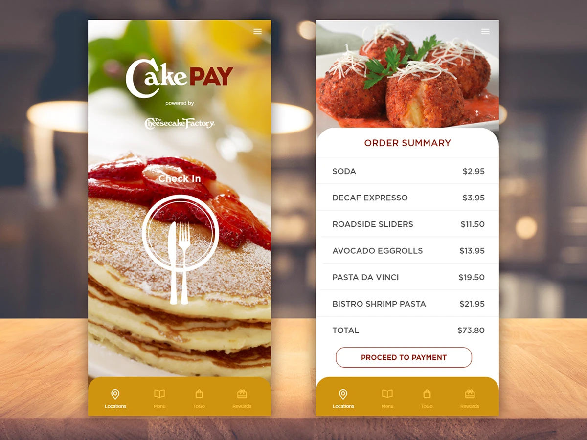
A 250-item menu is a feature in the dining room and a liability on a phone. CakePay lets guests check in to a location, browse and order ahead, and pay without waiting on a server, inside a brand system with very specific rules.
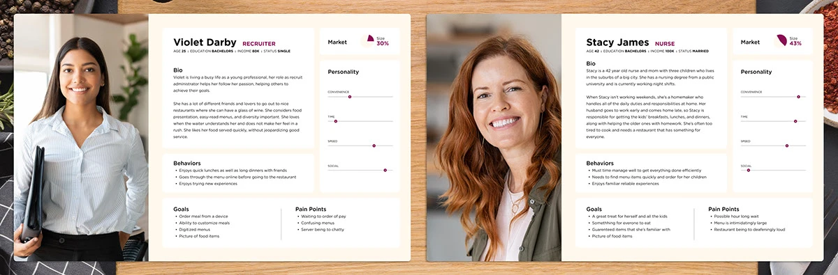
Research surfaced two very different guests with the same pain. Violet, a young professional, wants digitized menus, food photos, and quick customized ordering without a chatty server slowing her down. Stacy, a nurse and mom of three, needs to find familiar items fast and order for the whole family before anyone melts down. Both hit the same walls: waiting to order, waiting to pay, and a menu that's intimidatingly large.
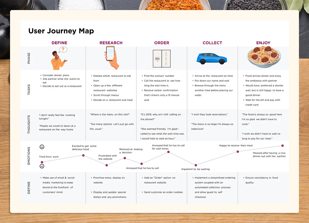
The journey map traced a couple's night out from "I don't feel like cooking" through ordering by phone, waiting on arrival, and waiting again to pay. The emotional low points cluster around every phone call and every wait, which is exactly where an app can take over: order ahead, skip the call, self-checkout.
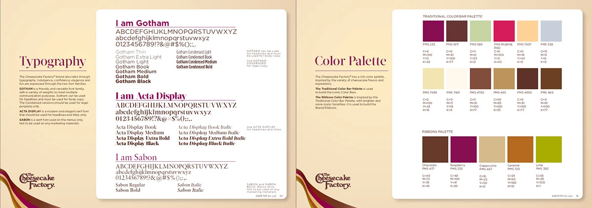
The Cheesecake Factory's brand book is prescriptive: Gotham for headlines and body, Acta Display for editorial moments, Sabon only in print, and two sanctioned color systems. CakePay's UI runs on the Ribbons palette (chocolate, raspberry, caramel) so the app feels like the restaurant, not a generic food-ordering template.
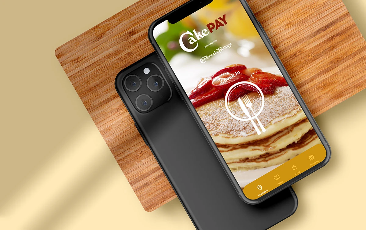
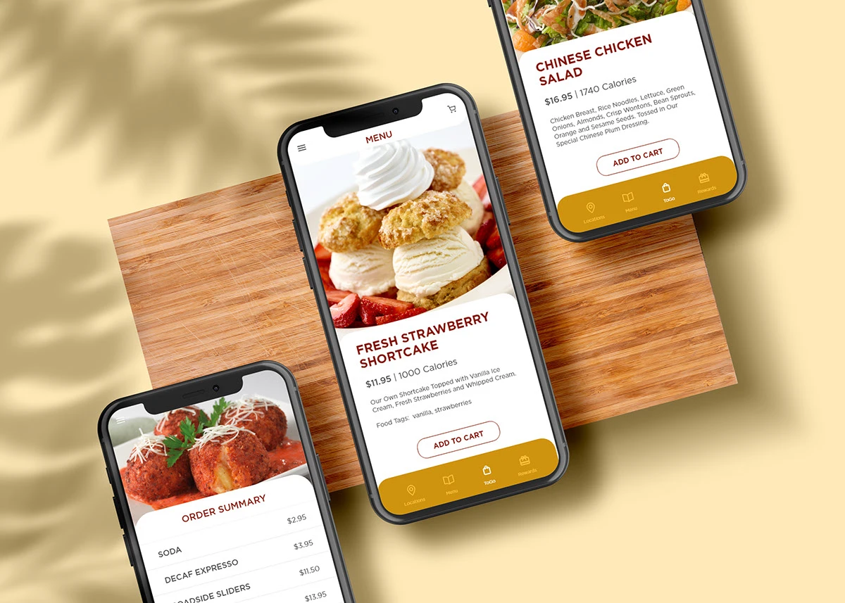
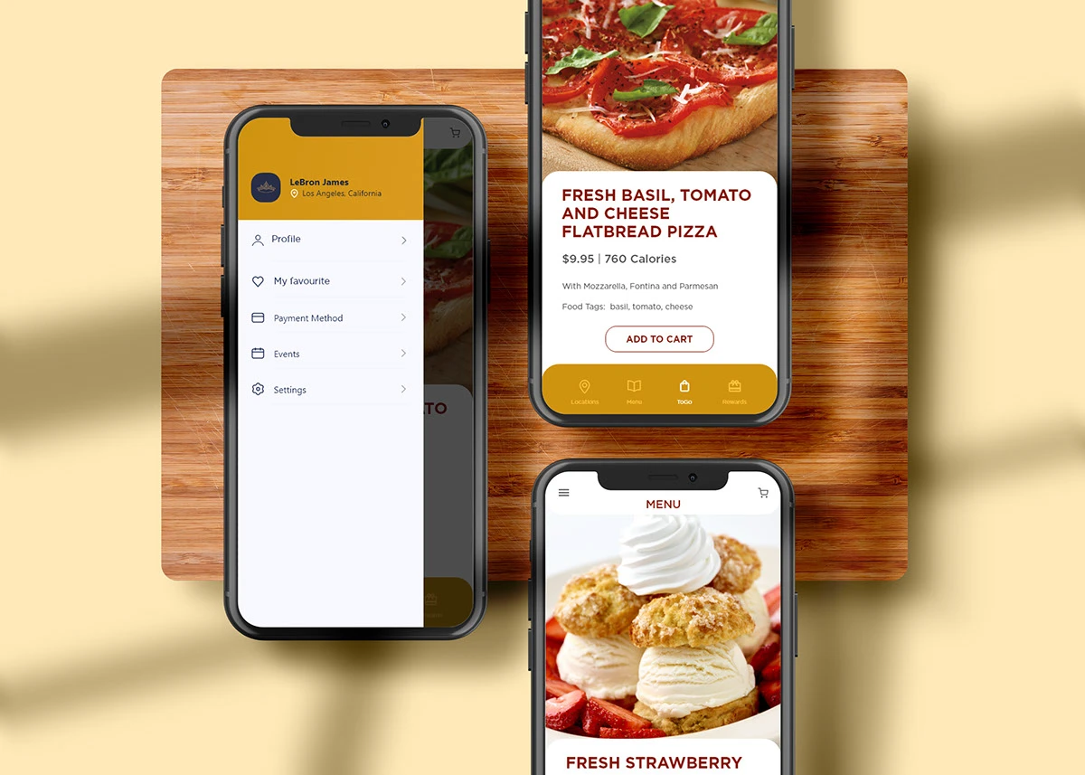
Check-in is one tap on a full-screen photo. Food is the brand's best asset, so photography leads everywhere. Menu items get the treatment they deserve: a full-width image, calories up front, plain-language descriptions, and one primary action. Ordering, favorites, payment methods, and rewards live one tap away in the drawer.
Success criteria were defined around the two personas: time from open to order placed, self-checkout completion rate, and repeat usage through the rewards loop.